Analytics Overview:
Perhaps the first questions to address when it comes to Analytics are:
1.
|
What do you use it for? And
|
Let’s address both questions to start, and then we’ll get into the specifics of setting up the analytics and printing out your results.
Analytics - What do you use it for?
Bottom line, analytics allows you to track sums across a range of records and break those sums down by criteria you have configured and selected using ManagePro User (Pick)lists to solve common “How much?” or “How many?” questions.
In the example below the sums of monies budgeted versus spent is being tracked across three projects (a filtered subset of all the projects in a ManagePro database), with the ability to look at the same data across either Project Type or Geographic Region (the 2nd and 3rd columns below), by simply dragging that column to the far left side of the analytics table. As you can see on the right half of the screen, ManagePro analytic views can be displayed in either table or the resulting graphic output, your choice, with the ability to toggle between table and graph always being available.

Analytics - How does it work?
Analytics always starts with a list of records that are pulled from the database and identified within an Analytic view by using the column Title. Those records are filtered based upon whatever criteria you select, as sums require a narrow focus on a specific record set to generate the desired results. As an example, if you were tracking Hours required to complete projects, you would want to filter out parent records with their “rolled up” Hours required values, so that you don’t duplicate sums already being tracked in the rows indented beneath them.
To that filtered list of records is added whatever fields you wish to use for:
a) the criteria you wish to use to analyze (differentially sum) the data, and
b) the fields to display the outputs
In the example below we are viewing a record list that has been filtered to display only 3 projects. We have selected Geographic Region and Project Type as criteria we will use to analyze the data. We have chosen Budget, Actual and Budget-Actual as the output fields to represent the date we need. In order to proceed with the analysis, we simply drag either the Geographic Region or Project type fields to the left side of the table.
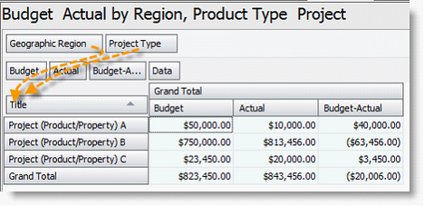
In the first example below, we have dragged Geographic Region to the far left side and are now displaying the Budget, Actual and Budget-Actual sums spent based upon Geographic region. In the
2nd example Project Type is moved to the far left side and totals are displayed based upon that criterion.
 
How to set up an Analytics Table
Setting up a table or view is accomplished using the following steps:
1.
|
First right mouse click in the grey shaded area of the quadrant view/table you wish to modify.
|
a.
|
Click on the "Show Field List" option.
|
b.
|
Then find, and using your left mouse click, highlight and drag the fields from the "Pivot Grid Field List" you want to use in the table into the areas designed with the text "Drop Data Items Here" as a general working area. Or, you can directly drag the fields to "Drop Row Fields Here" for your title and criteria fields and "Drop Column Fields Here" for your output (numeric or currency) fields.
|

c.
|
Position the order Columns to meet your needs by dragging them into the desired order. Be sure to remember to include the field "Title" in your row fields so you can identify the records you are working with.
|

2.
|
Next you need to filter the records displayed to achieve accurate outputs. The simplest way to set up your filter criteria is to right click in the white space under the table and choose the “filter” option from the right click menu.
|

Filter criteria are set up using the exact same process as defining filters in the other ManagePro work spaces. Although there are more than 200 available fields to use for filtering, the most common filters are based upon a date range or a pick list value (ex. Priority of 1, or a picklist value such as Balanced Scorecard equals Finance.
Additional Setup Tips:
1.
|
First of all, you can also sort the record in the column display using the sort button in the upper right, or click the List icon to filter which records or how many variables you want to include in the analysis. To configure the Grand Total column displays, use the right click menu “Column Options” to set format, decimal places and scaling.
|

2. To get the pivot table to add up the totals or counts of the output fields selected, you must drag the “Count” field out of the Pivot Grid Field List and onto the pivot table using the right click in the top grey areas of the pivot table and selection of “Show Field List.”

3. If you wish to add a column to display the "Percentage of Total", or an "Average" calculation based upon a selected column of data, first highlight that column, then right click and select these fields using the Add Column or Add Total options respectively.

Creating a Graphic Output
Having set up your pivot table, at some point you will want to convert the table output to a graphic chart for viewing or printing. Let’s discuss how to do that next using an example in which we want to create a graph of the % of fund equity based upon property type.
|

2.
|
First select (left click) the column of data you wish to graph, then right click and choose “Add column” and choose the option “Percentage of Total”.
|
3.
|
Next right click in the pivot table and check “Chart Options”.
|
4.
|
In the Chart Configuration box check “Show Simple Series”.
4. In the “Series Type” field use the drop down to select the type of chart you want to create. In the “Series Labels” and “Series Values” fields select the columns you wish to include in your graphical chart.

5. Next, select the Chart Appearance tab and configure the chart legend and labels to be used, then click OK.

|
6. Create a Chart Title using the right click menu “Pivot Table Title & Descriptions” link.

|
|
|
|
7. To display the chart use right click Show Chart  option. To return to the pivot table, use the right click option of Show Pivot. option. To return to the pivot table, use the right click option of Show Pivot.
|
|

8. To print the chart, right click and choose the “Copy to Clipboard” and then paste into Word, Excel, Power point or any other program you wish to print from. Note you can also export the entire pivot table into Excel for additional calculations or graphics using the right click menu “Export to Excel” option.
|
|